How To Create A Registration Form?
Registration forms let B2B customers apply for wholesale access directly from your storefront. The Smind B2B Registration Form builder lets you create custom B2B signup forms using a drag-and-drop interface. Shopify’s default registration only collects a name and email, which is rarely enough for B2B. With this builder you can ask for company details, tax IDs, business licenses, expected order volume, and anything else you need to vet wholesale applicants.
1. Create a registration form
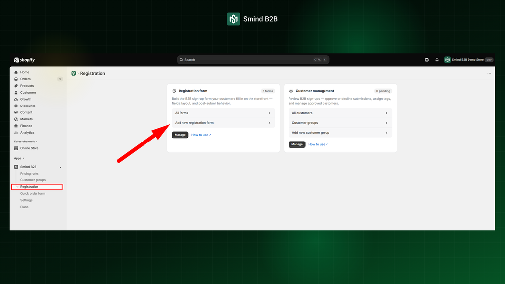
- Go to Apps > Smind B2B & Wholesale.
- Click Customers in the sidebar, then open the Registration Form tab.
- Click Add new registration form.
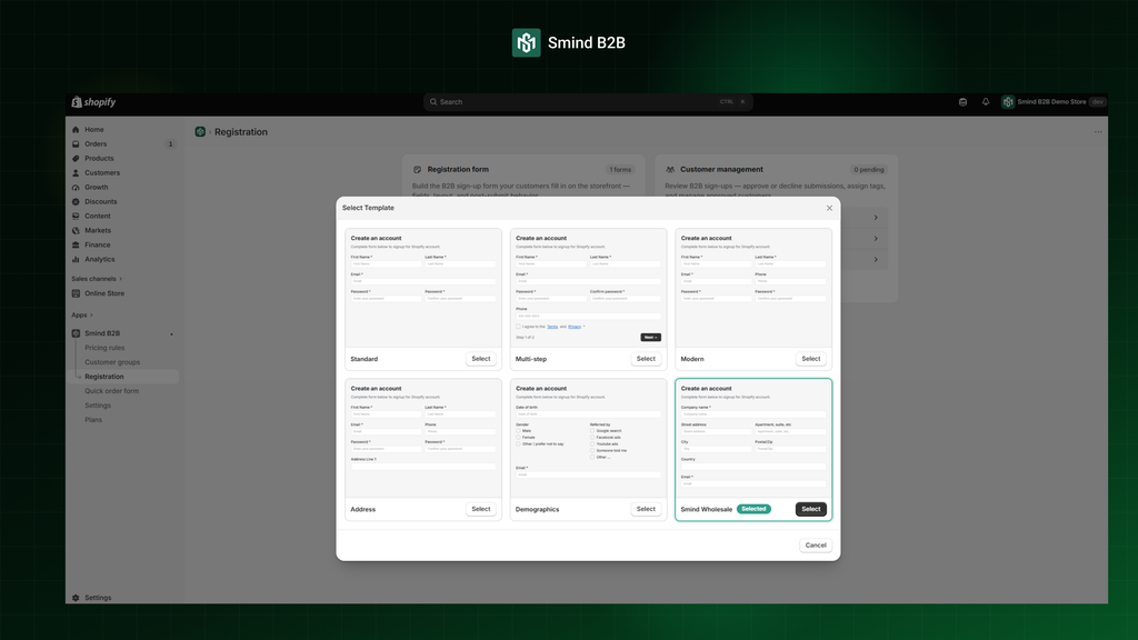
- Choose a starter template or start blank. Those are list of pre-designed templates:
- Standard: Basic fields for name, email, company, and a message area
- Modern: Streamlined layout with a clean card design
- Address: Adds full shipping/billing address fields
- Demographics: Includes industry, company size, and revenue range
- Smind Wholesale: Pre-built for wholesale applications with tax ID and order-volume fields
- Blank: Empty canvas — add only the fields you need
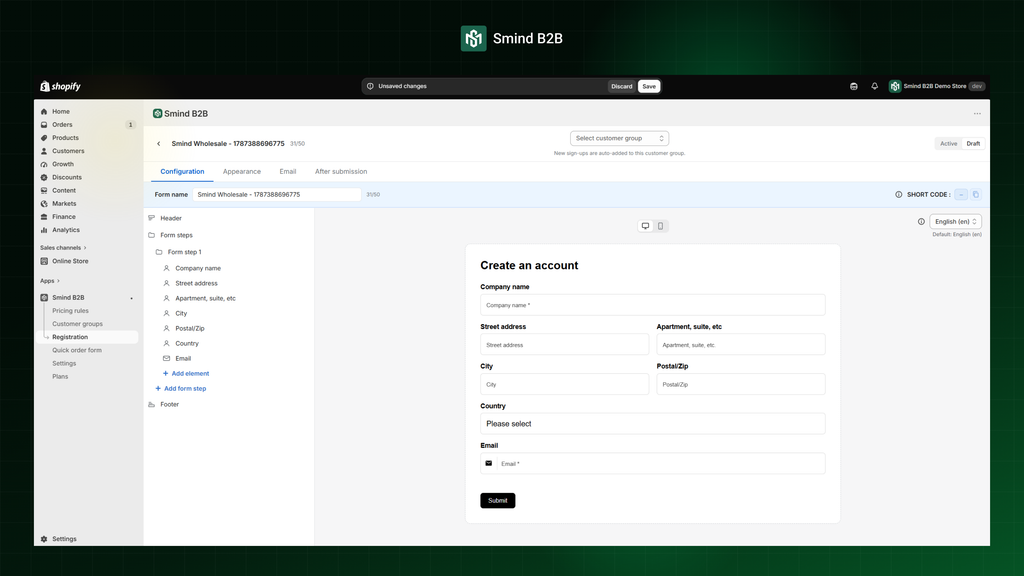
After selecting a template you enter the form builder. It has three tabs: Configuration, Appearance, Email and After submision
2. Configuration form
On the Configuration tab:
- Form Name: This is the internal name of the form. It is used for admin identification only and is not displayed to customers. You can rename it at any time.
- Customer Group: Use the dropdown at the top to assign the registration form to a specific customer group. Any customer who registers through this form will automatically be added to the selected customer group after their application is approved or their account is created, depending on the configured approval mode.
- Status (Active / Draft): Switching the status to Active immediately publishes the form, making it available to users. Keeping it as Draft hides the form from customers.
- Preview Mode (Desktop / Mobile): Switch between desktop and mobile previews to verify how the form will appear on different devices before publishing.
2.1. List of form fields
The left sidebar is where you build and manage the entire form. From here, you can add, edit, reorder, and configure all form fields and elements:
- Header Section: This section appears at the top of the form sidebar. You can customize the form title and description displayed beneath it. You can also adjust the text alignment, heading tag, and font size.
- Account Step Section: This controls the form step itself, not the individual fields within it. You can change the step name, which is visible only to administrators in the backend.
- Name Element: This element manages both the First Name and Last Name fields. You can customize the label, placeholder, character limit, and icon. You can also add a description, hide the label, mark the field as required, and adjust its column width.
- Email Element: This element controls the email address field. You can customize the label, placeholder, description, icon, character limit, hide the label, mark the field as required, and adjust its column width.
- Phone Element: This element controls the phone number field. You can customize the label, placeholder, description, icon, and character limit. You can also enable international telephone number validation, display the country flag or dialing code, choose a default country, hide the label, mark the field as required, and adjust its column width.
- Accept Terms Element: This element displays the Terms & Conditions acceptance checkbox. You can customize the label and description, set it as checked by default, mark it as required, and adjust its column width.
- Additional Information Step: For the next step, you can remove existing elements and add new ones by clicking the Add New Element button. For example, you can add a Company Info element.
- Company Info Element: This element includes multiple company and address sub-fields, such as Company Name, Address, Apartment, City, Postal Code, and Country. Each sub-field has its own label, placeholder, and Required setting.
- Footer Section: This is the final section of the form. Here, you can customize the footer description, text alignment, Next and Previous button labels, Submit button text, and the submit tooltip message.
To configure each field, click any field in the preview to open its settings:
- Label — the name shown to customers (e.g., “Company Name”).
- Placeholder — hint text inside the empty field.
- Required — toggle on to make the field mandatory.
- Validation rules — extra rules such as minimum length or number range.
- Conditional logic — show or hide the field based on another field’s value (e.g., show “Tax ID” only when Country = United States).
- Column width — 100% (full row), 50% (half), or 33% (one-third) to place fields side by side.
For selection fields (checkboxes, radio, dropdown) you also manage the list of options.
Submit button: Click the submit button in the preview to change its label (e.g., “Submit Application”, “Apply Now”).
2.2. Multi-step forms
Split a long form into multiple steps so customers see a wizard-style experience instead of one long page.
- Click Add step in the builder toolbar.
- Drag fields into each step.
- Give each step an internal name (not shown to customers).
- Customers see Next / Back buttons between steps, then a Submit button on the last step.