How to setup Information Tabs 1
What is the Information Tabs 1 section?
We all understand how a folder with tabs helps organize documents so we can find them easily. In web design, this concept is used to neatly organize and display product features.
This tabbed section transforms a standard product description into an engaging showcase. Take the specialty coffee in the example. It has a unique flavor, a specific origin, and a detailed processing method. A tabbed layout lets you present this information elegantly.
When a customer clicks a tab, the relevant information is displayed instantly without them needing to leave the page. This saves space, creates a very clean look, and allows customers to interact directly with the details that interest them most.

Click here to see the link demo ->
How To Install The Information Tabs?
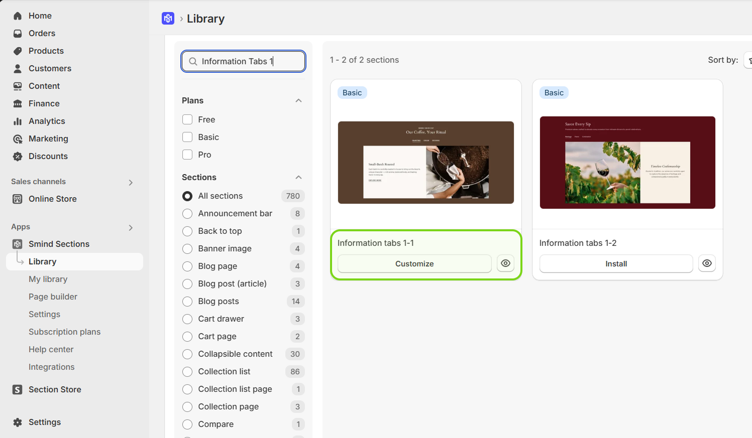
Step 1: In Shopify Admin, going to Smind Section app and find Information Tab 1-1 in Section tab of Library. Click Install and Customize it.
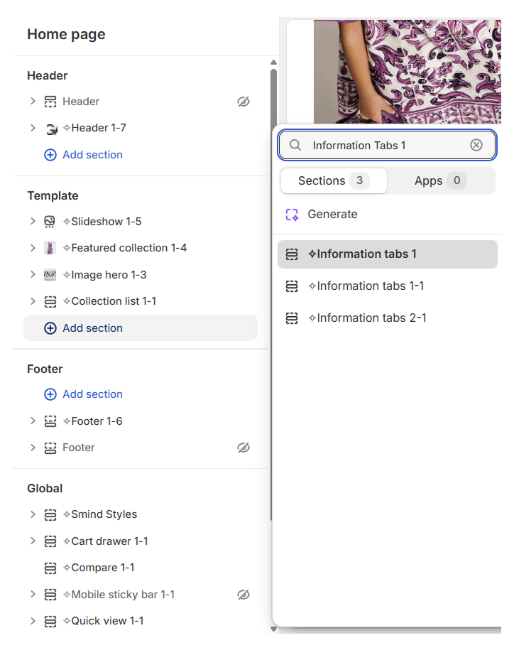
Step 2: Going to Shopify Editor sidebar, choose any page template and click Add Section -> Information Tab 1-1
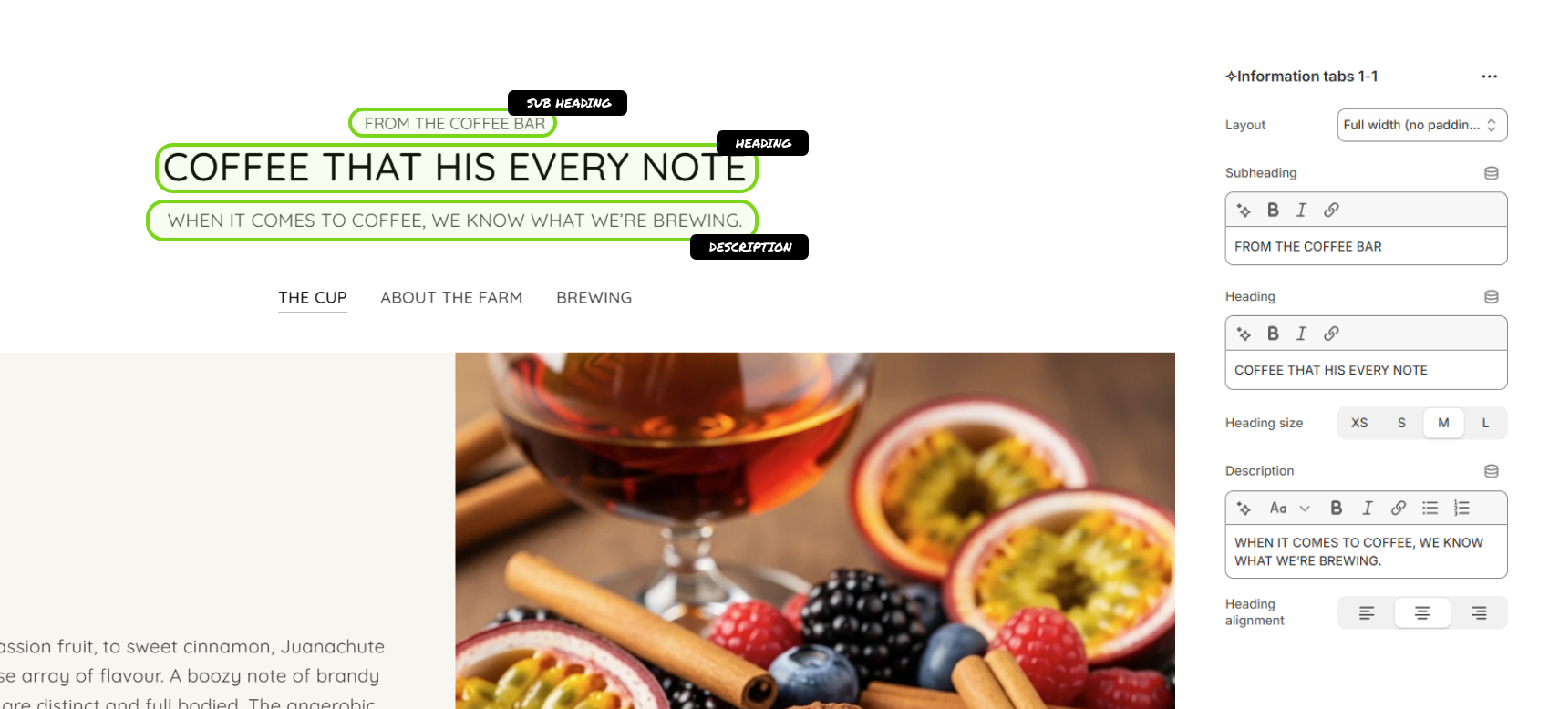
Step 3: Now you can customize for the layout, media, content, color and spacing of this section
General Settings
- Layout: This dropdown determines the width of the section on the page.
- Subheading: An introductory line of text.
- Heading: The main title for the section.
- Heading size: Controls the font size of the heading text.
- Description: A rich text field for a short paragraph below the heading
- Heading alignment: Sets the horizontal alignment for the Subheading, Heading, and Description.
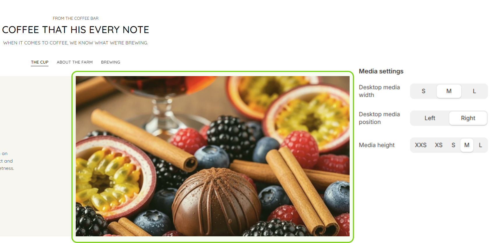
- Desktop media width: Adjusts the width of the media on desktop screens.
- Desktop media position: Determines whether the media appears to the left or right of the tab content.
- Media height: Sets the height of the media container. The options are XXS, XS, S, M , and L.
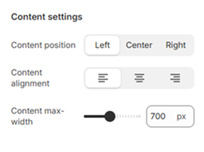
- Content position: Aligns the block of content within the tab.
- Content alignment: Sets the horizontal alignment of the text inside the content block.
- Content max-width: A slider that controls the maximum width of the text content to ensure readability.
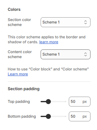
- Section color scheme: This scheme applies to the border and shadow of the cards
- Content color scheme: This scheme applied to the background and text color of the main content area within the tabs.
- Top padding: Controls the amount of empty space above the section’s content.
- Bottom padding: Controls the amount of empty space below the section’s content.
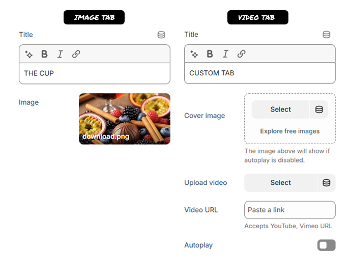
Image/ Video Block Settings – Information tabs
- Title: This field is for the name of the tab
- Image: This is where you select the image that will be displayed when this tab is active.
- Cover image: This is a placeholder image that is displayed before the video plays.
- Upload video: This option allows you to upload a video file directly from your computer to your Shopify files.
- Video URL: You can paste a link to a video hosted on another platform. The field specifies that it accepts YouTube
- Autoplay: This is a toggle switch that, when enabled, will cause the video to start playing automatically as soon as the tab is opened
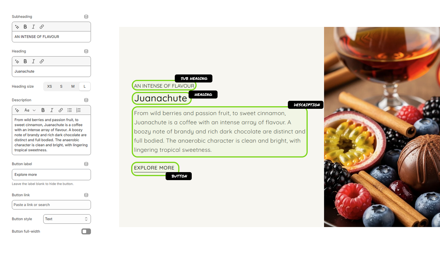
- Subheading: This is a small, introductory line of text that appears above the main heading to provide context.
- Heading: This serves as the main title for the content within the tab.
- Heading size: These buttons allow you to adjust the font size of the Heading text for visual hierarchy.
- Description: This is a rich text editor for the main body of text.
- Button label: This field defines the text that will appear on the button.
- Button link: This is where you set the destination URL for the button.
- Button style: This dropdown menu determines the visual appearance of the button.
- Button full-width: This is a toggle switch that controls the button’s width.